I am an interactive media designer based in Oshawa, ON. I give brands a unique visual identity & challenge users with new & memorable experiences that stand out.
My Projects
Synthesis Outdoors
Retail installation & brand considerations
Hidden Objects Game
Interactive game for young children
Nutritional Guide to Oranges
Multi-stage infographic
Nintendo Switch Features Video
Non-official advertisement
Discover Muskoka Travel Video
Non-official travel ad for the Muskokas
Family of Eateries Mobile App
Navigational app for three chain restaurants
Starfish Parenting Support Program
Collaborative project for a client
Digital Signage
News pane with php integration
About Me
With 2 years of education in the Interactive Media Design course at Durham College, I possess knowledge on making quality icons, layouts & motion graphics using the full capabilities of the Adobe Creative Suite to create an eye-catching website that is easy to navigate for everyday users.
DOWNLOAD RESUME
My Skills:
Contact Me
Go Back
I am an interactive media designer based in Oshawa, ON. I give brands a unique visual identity & challenge users with new & memorable experiences that stand out.
Digital Signage
Project Overview
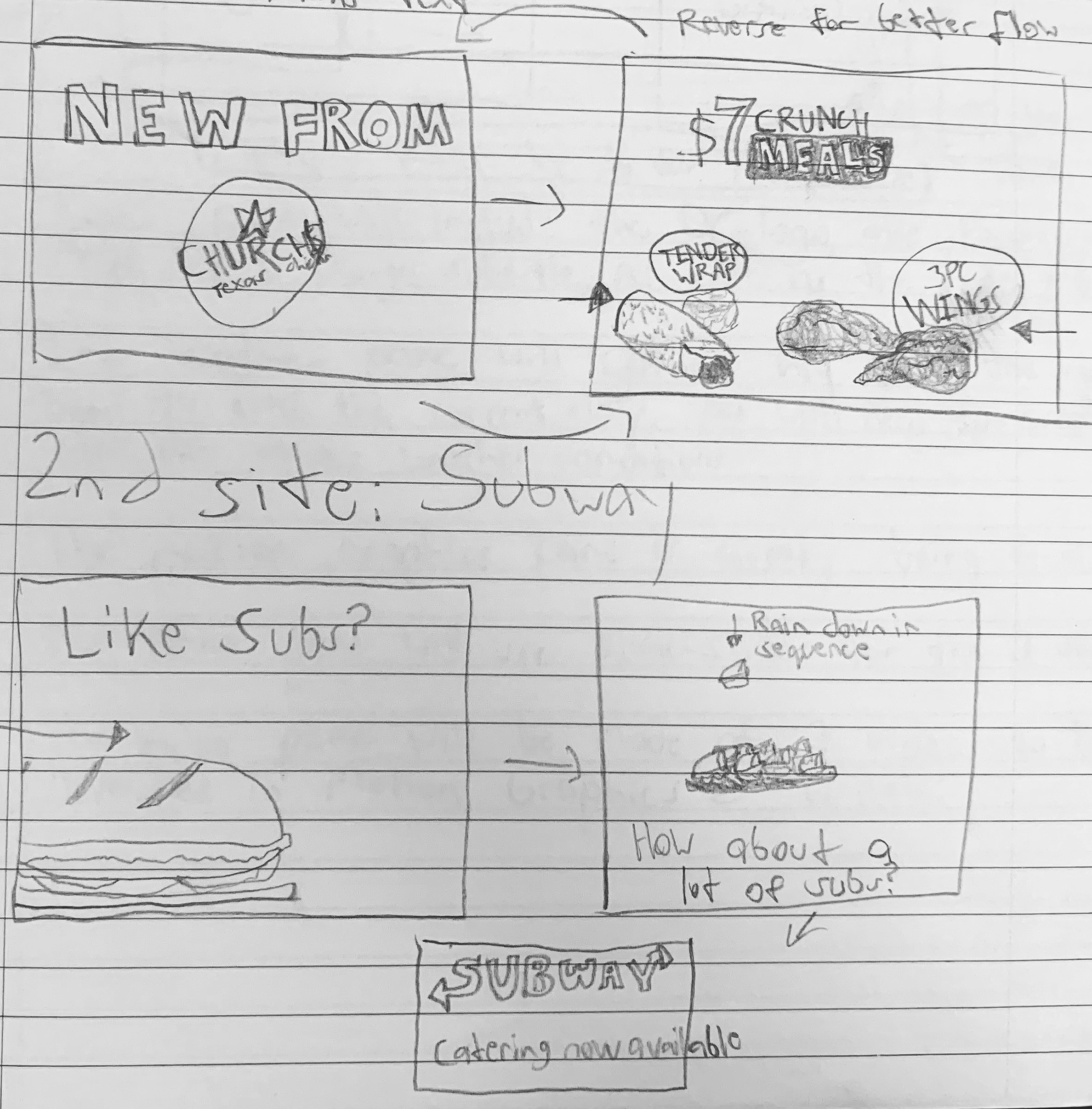
Rough sketches for motion graphic ads
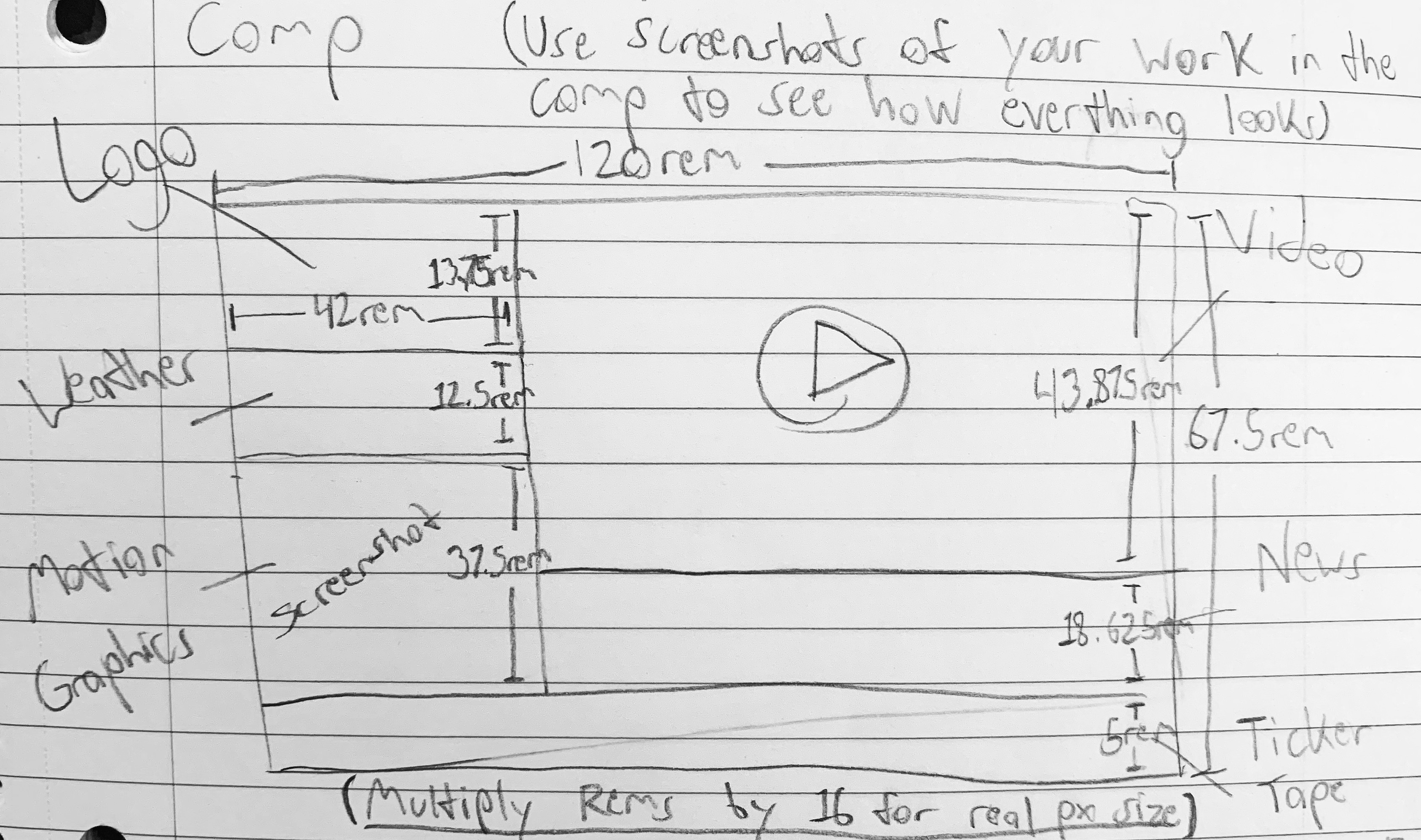
Rough sketch for news panel measurements
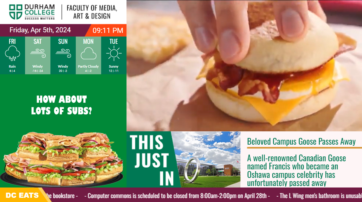
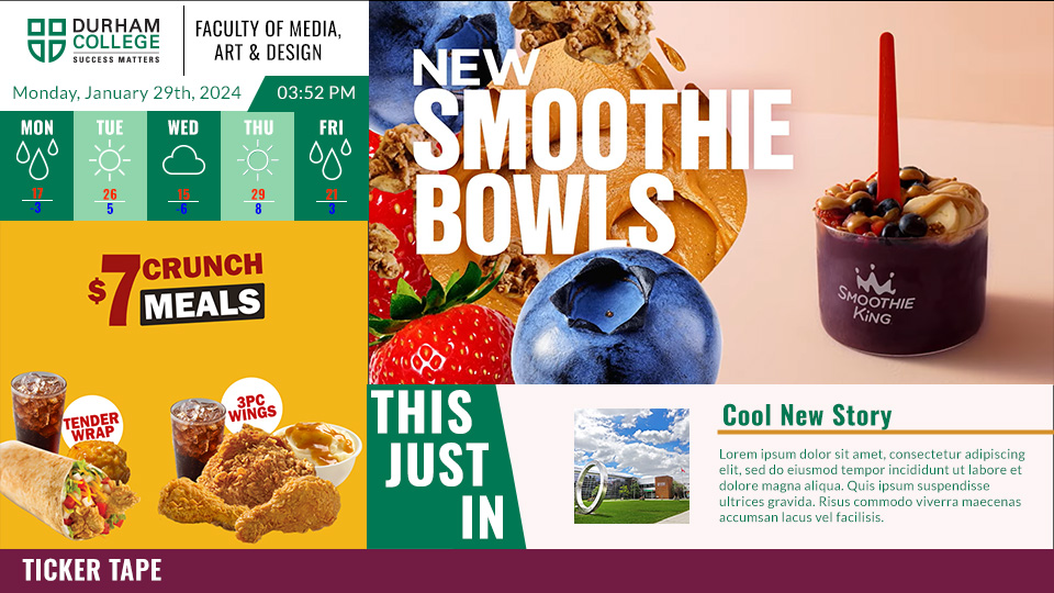
This project was a long term multi-stage process that I tackled one step at a time over the course of twelve weeks. It went through multiple stages of planning, draft work, creating & implementing. The end result was a functional news panel similar to those featured on CP24 that actively displayed motion graphic & video advertising, news headlines & weather conditions. All of these panels are able to be updated & changed through the use of a back end creating using php so the owner can update, alter or delete all the information displayed in the panel whenever they please with minimal downtime.
Project Objective
The objective of this project was to gain experience working on a long term project that would require various stages of development, as well as learning how html, css, javascript & php can interact to form a functional front end for users as well as a back end for developers. I gained a wealth of knowledge as to how professional web developers would handle creating a product for a client that could be actively updated many years down the line.
Baseplate for news pane design
Updated baseplate with rough content
The Process
In the beginning, I planned out the advertisements I would create through storyboarding & asset gathering. For the initial stages I focused on the motion graphic ads made using gsap. Afterwards, I moved on to the early designs of the logo, weather, & news panels as well as the ticker tape. After the designs were finalized, I proceeded to create the codebase for the news panel using html, css & javascript with guidance from my professor to link the ads to their respective panels & control the pacing of each animation. Finally, I created the video based commercials & implemented them into the final iteration of the front end codebase. This would mark the beginning of my advancement to stage 2.

This stage involved the creation of an admin panel to serve as a back end which could be used by a developer or business to keep the news window updated with new information through a database & php connections. This panel would source its content from my database held on the phpmyadmin website that contained every piece of information or file being used by the front end page, allowing those with access to the back end the ability to edit said database through the admin panel.
Deliverables
At the end of this long process, I was left with a professional grade news window that operated thanks to many moving pieces that could be dynamically edited by anyone with ownership over the product & access to the admin panel. Along with this news window, I had also created three gsap motion graphic ads as well as three video commercials made with Adobe After Effects & additional assets made in Adobe Illustrator.
Project Tools
Go Back
I am an interactive media designer based in Oshawa, ON. I give brands a unique visual identity & challenge users with new & memorable experiences that stand out.
Starfish Parent Support Program Collaberative Project
Project Overview
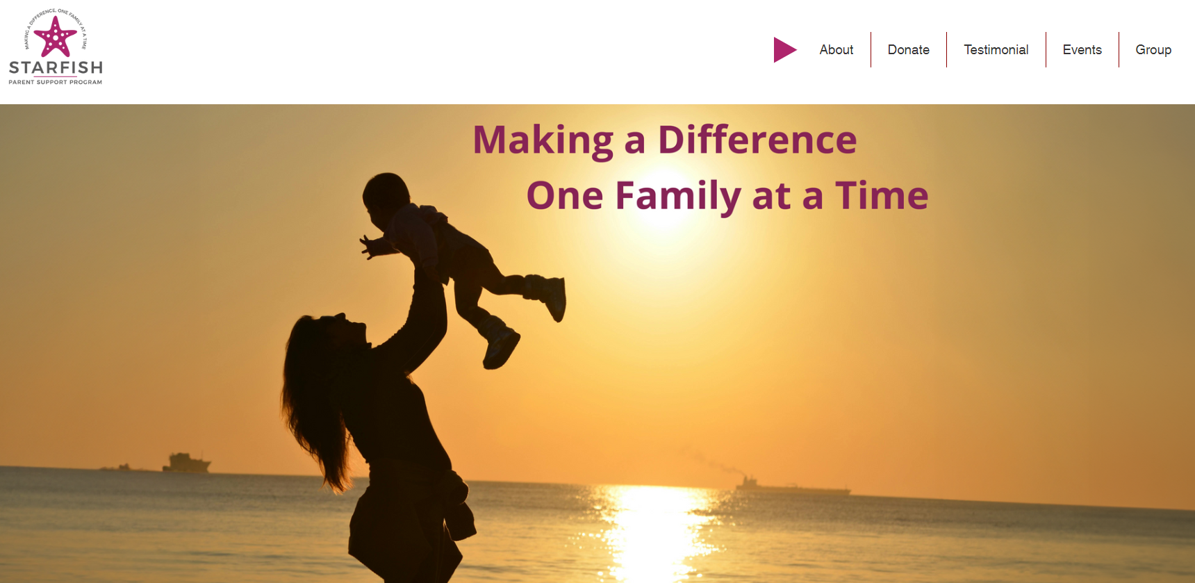
Starfish main page draft
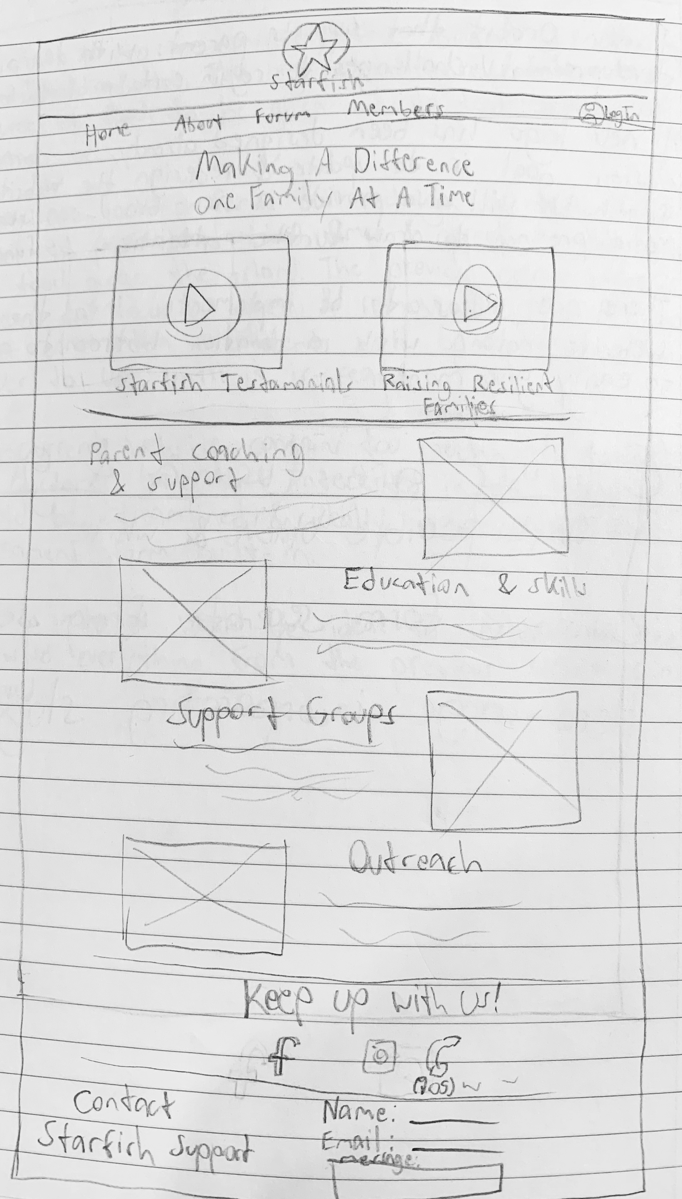
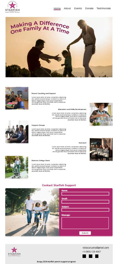
This project was my first team based endeavor interacting with a real client & their business. Our team was split into a design side & a web programming side, along with 2 team leaders assigning tasks & handling communication with our client. Starfish Parenting Support Program was an established business so we were provided with a logo & colour scheme to work with. We were given the option to decide on what webfonts we would use along with the handling of each page.
Project Objective
The objective of this project was to gain experience working with others to synchronize deadlines as well as maintaining consistency across each page despite them being designed by different people. This project tested my skills in communication & planning since if either were lacking we would end up with an unsatisfactory finished product with imbalanced levels of quality along with a dissatisfied client.
Main page desktop size
Main page mobile size
The Process
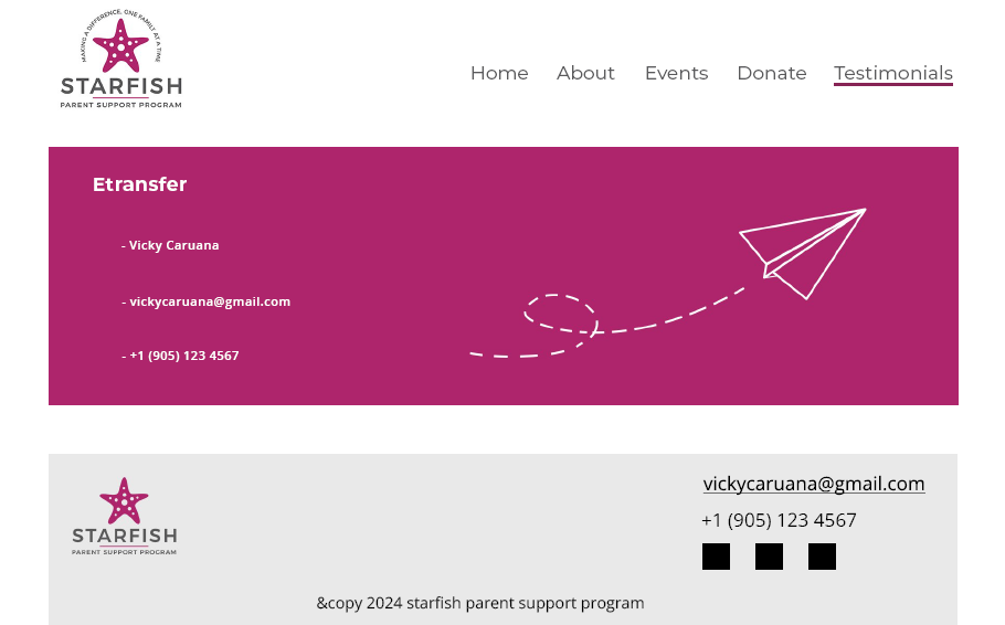
Donations page desktop size
Donations page mobile size
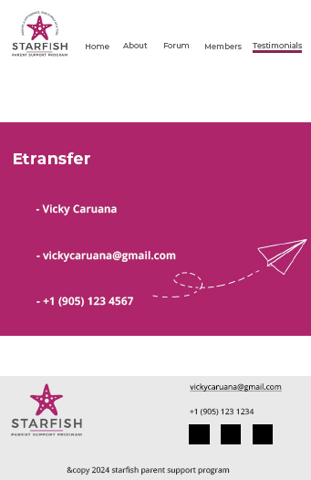
As work began I was placed on the design team & began on my first task of drawing up a rough mockup for the main page. Other team members were responsible for the other pages of the site, so I had to maintain consistant contact with them through Discord & our weekly meetings to ensure we were all following the same rules. Starfish's main clientele is parents with cognitive challenges, so the team decided to keep each page layout simplified & unchallenging to be as accessible as possible. Later on, I was given the additional responsibility of designing the donations page to provide users with information to donate money to Starfish as a non-profit organization. Due to security concerns with the website, we decided to avoid including fields to input banking information, instead opting to provide users with our client's etransfer address.
Deliverables
After many weeks of planning, working, consulting & revising, we reached our finished product that we proceeded to present to our client. Using our designs as a base, the web team developed a complete website for Starfish Parenting Support Program that can be viewed here.
VIEW PROJECT
Project Tools
Go Back
I am an interactive media designer based in Oshawa, ON. I give brands a unique visual identity & challenge users with new & memorable experiences that stand out.
Family of Eateries Mobile App
Project Overview
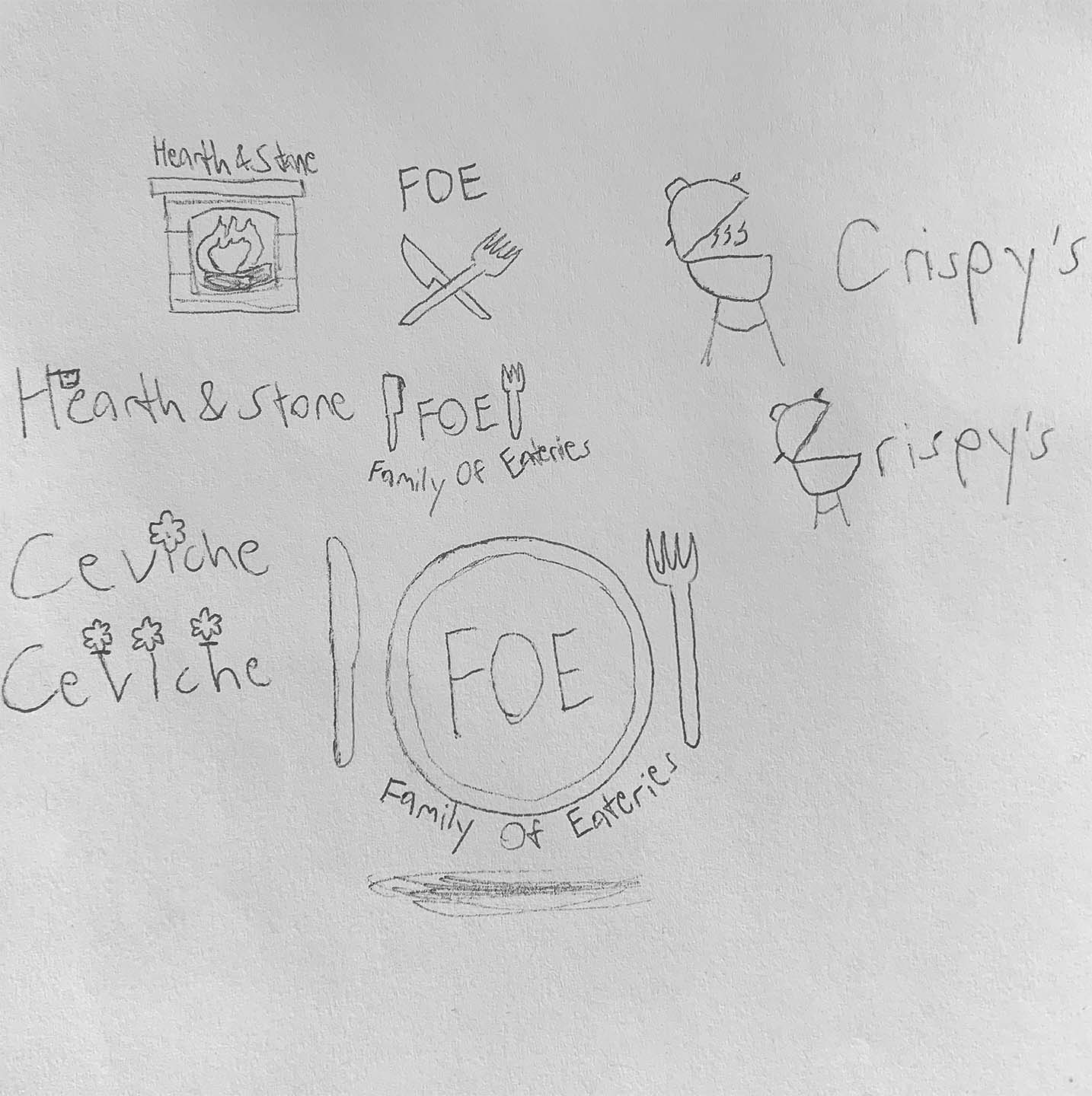
Restaurant wordmark brainstorming
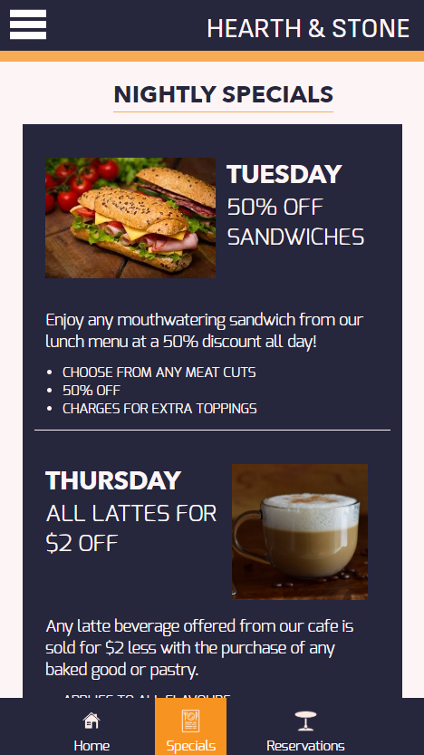
I was tasked with creating three distinct yet cohesive restaurant brands called Ceviche, Hearth & Stone, and Crispy's under the umbrella of a parent company "Family of Eateries". These three branded restaurants were then used to create a Family of Eateries mobile app that allowed the user to view all 3 restaurants. Through the app, users can see reviews & special menu offers provided by each restaurant, as well as schedule and book a reservation.
Project Objective
The objective of this project was to utilize my knowledge of html, CSS & javascript to create a mobile app that excelled in accessibility & brand consistency. The app needed to flow well & be easy to read while still getting all crucial information across & being easy to use.
3 restaurant wordmarks
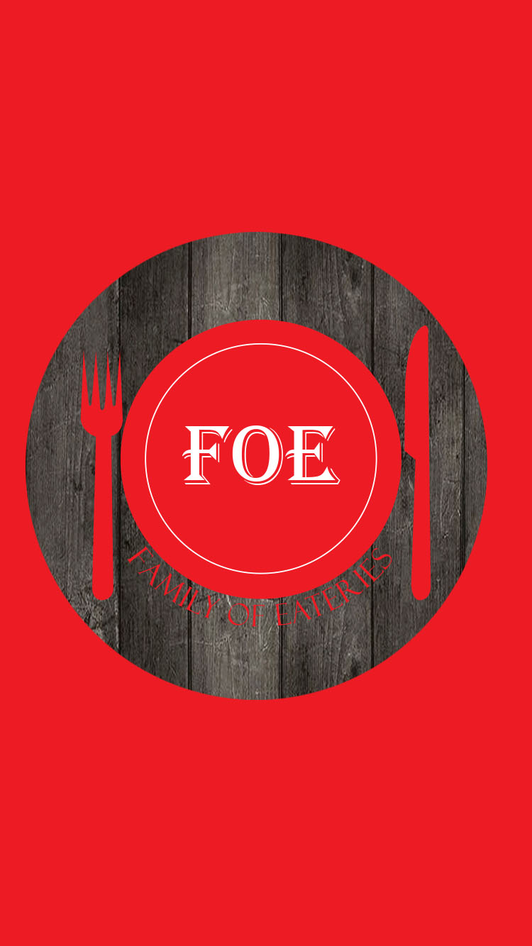
Loading screen
The Process
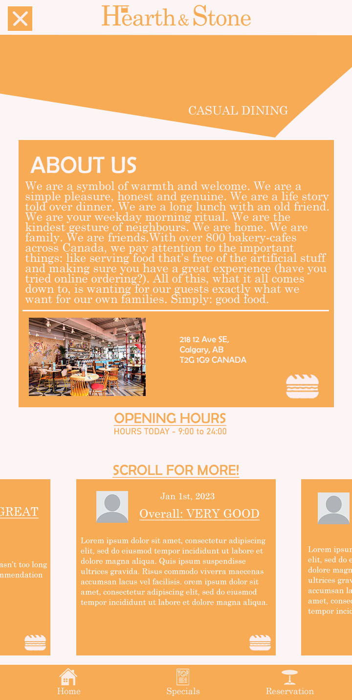
H&S original design
H&S final design
The beginning of this project was plenty of rough sketching, researching & brainstorming. My plan for the restaurant went through multiple stages & changed drastically as it neared completion. I created my assets & layouts with Adobe Illustrator & Photoshop, which proved invaluable through the process of integrating everything into code. I had to deepen my understanding of traditional restaurant branding strategies to make my app more effective. The menu had to emphasize the right things to properly draw a user's attention, while the reservation form needed to be properly structured so anyone could understand & use it effectively & receive proper feedback upon completion.
Deliverables
The end product of this project was a functional mobile app that retains consistency across 3 restaurants while making each distinguishable from the other. The finished app can be accessed here to more thoroughly understand the experience.
VIEW PROJECT
Project Tools

Go Back
I am an interactive media designer based in Oshawa, ON. I give brands a unique visual identity & challenge users with new & memorable experiences that stand out.
Muskoka Travel Ad Video
Project Overview
For this project I was tasked with creating a travel ad style video that you would see playing in places such as a dentist's office, restaurant, waiting room, etc. This video's purpose is to highlight the attractive features of the Muskoka region for people interested in cottage culture.
Project Objective
The objective of this project was to further my skills with Adobe After Effects in order to create an effective advertisement that could catch the eye of onlookers & possibly even sell them on the idea of spending a summer in Muskoka.
The Process
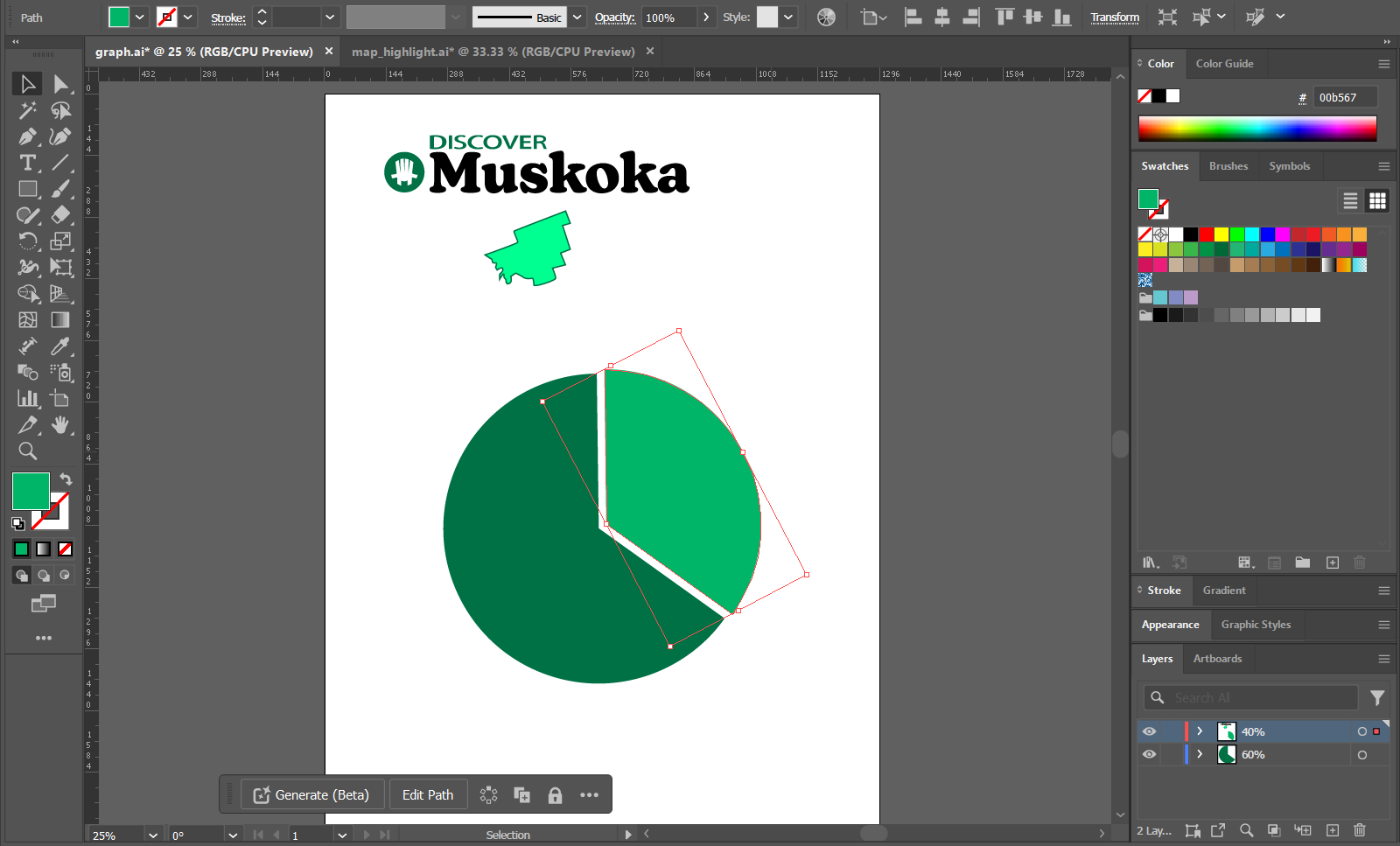
Illustrator assets & wordmark recreation
This project started with gathering statistics so I could find key points to advertise. Once the information gathering was finished, I moved on to planning out my shots & drawing the assets I would need for animations. After everything was ready, I began putting the video together.
Deliverables
The end product of this project was an effective advertisement lasting 39 seconds that features accurate data & motion graphics to sell people on the joy of living in the Muskoka region. The completed video can be viewed below.
Project Tools
Go Back
I am an interactive media designer based in Oshawa, ON. I give brands a unique visual identity & challenge users with new & memorable experiences that stand out.
Nintendo Switch Features Video
Project Overview
This project tasked me with creating a video focusing on an aspect of my choice based on a preexisting brand. I opted to create an advertisement based on the Nintendo Switch as I personally own one & have a long history with Nintendo & its products.
Project Objective
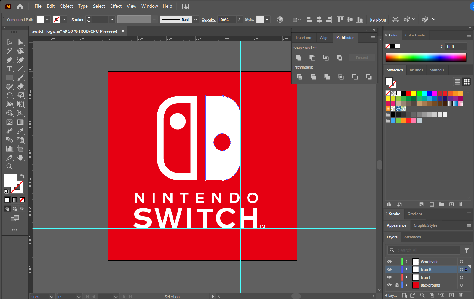
Recreation of Switch logo as an SVG
The objective of this project was to develop my skills in working with an established brand by following its rules & restrictions. I was forced to limit my usage of fonts, colours, imagery & animation techniques to create a finished product that fit naturally with official creations from the Nintendo Switch brand of marketing.
The Process
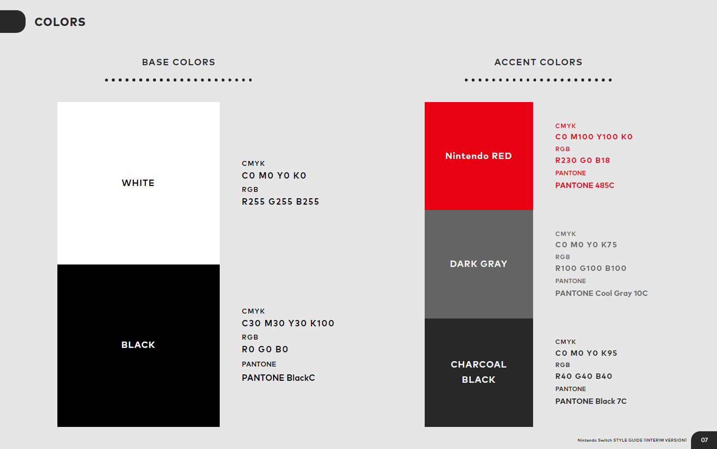
I began by acquiring a Nintendo Switch interim brandbook to learn the exact fonts & colours I needed to use, then proceeded to create my own Switch logo vector & collected the images I needed for my video. Once all my assets were assembled, I began importing them into After Effects to put everything together.
Excerpt from the interim brandbook
Deliverables
The final result of this project was a fifty four second long video that accurately replicated the Nintendo brand & showcased the full range of features the Nintendo Switch offers. The finished product can be viewed here:
Project Tools
Go Back
I am an interactive media designer based in Oshawa, ON. I give brands a unique visual identity & challenge users with new & memorable experiences that stand out.
Nutritional Guide to Oranges Interactive Station
Project Overview
For this project I had to create an interactive application that would take the user through multiple screens through touch interaction. I was given free reign to decide on the style & content of the application, but it was required to have at least four unique screens with new information.
Project Objective
The objective of this project was to further hone my skills in idea crafting & visualization. Being responsible for the core idea of the application & ensuring it comes to fruition forced me to think beyond the scope of merely following instructions, instead relying on my own creativity to see everything through.
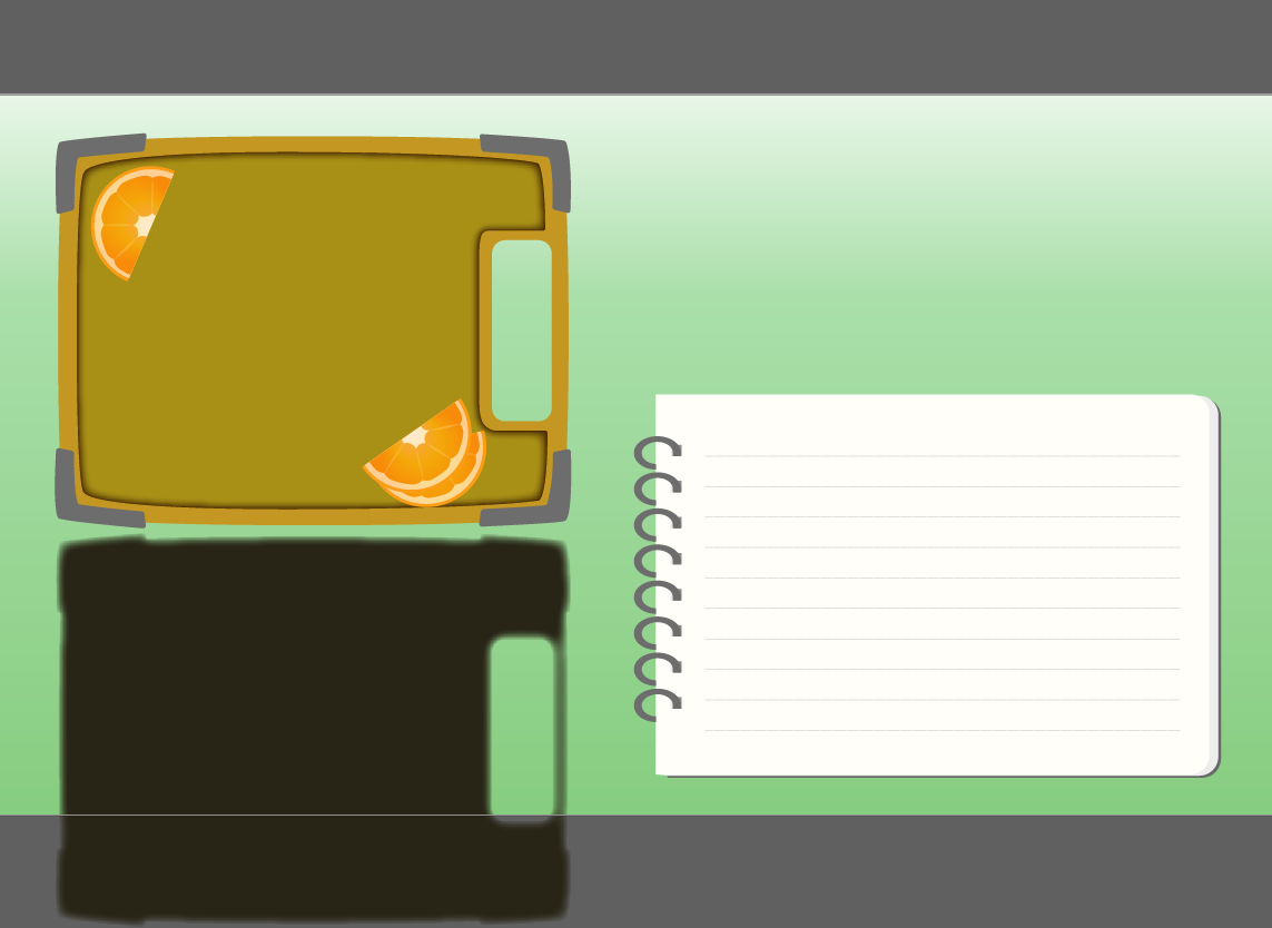
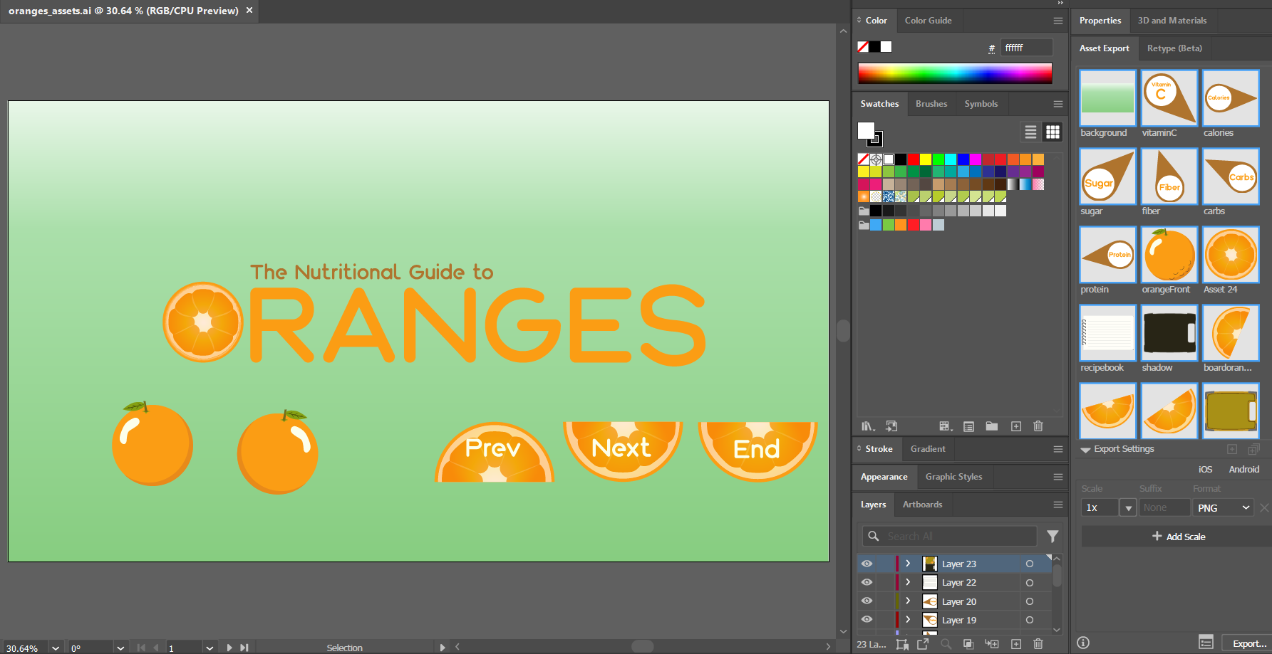
Illustrator assets for screen 2
The Process
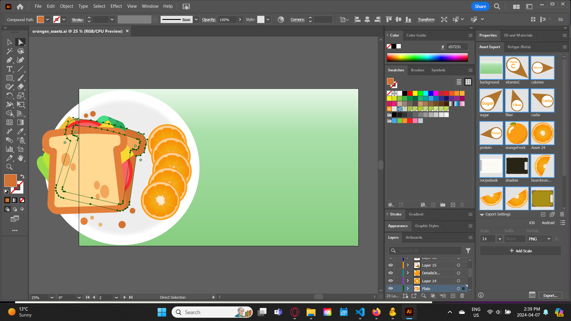
Illustrator assets for screen 4
I used this project as an opportunity to hone my skills with Adobe Illustrator & After Effects. I decided on Oranges as a topic because it posed a unique challenge to draw & animate in various unique ways. I altered all four screens to be motion graphic videos to give myself an opportunity for additional practice in After Effects & simplify the code required to complete the application.
Deliverables
The end product of this project was a web application that provides four uniquely animated screens that display nutritional information about oranges along with instructions for an orange chicken recipe. Interaction is simple through the use of labeled buttons to move back & forth through each screen. The completed application can be viewed here:
VIEW PROJECT
Project Tools

Go Back
I am an interactive media designer based in Oshawa, ON. I give brands a unique visual identity & challenge users with new & memorable experiences that stand out.
Time Limited Hidden Objects Game
Project Overview
For this project I was tasked with creating a hidden objects game that would require the player to find 20 requested items across four unique screens within the time limit of four minutes. I was allowed to decide on the target audience & aesthetic of the game, so I opted to make a game targeted towards young children as an educational experience.
Project Objective
The objective of this project was to put my javascript knowledge & Illustrator skills to the test, as I would need them both to create a complicated application that featured dense visuals to provide adequate challenge as a puzzle. With assistance from my professor I proceeded to create an intricate game that gives the player a time limit along with options to change which screen they are playing on & reset the timer if the young user is having too much trouble.
First puzzle drawing in Illustrator
The Process
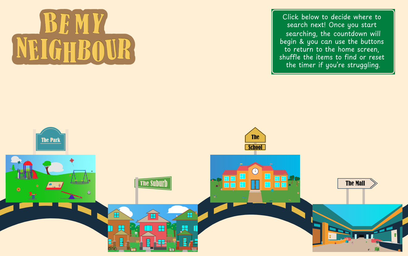
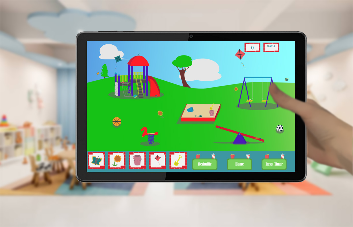
The game as it appears in action
I began by brainstorming to decide on my setting & audience. I wanted to make a game for young children so I chose a local town as my setting. For my four locations I decide on a suburb, a park, a school & a mall as those were all prominent features of my own hometown. Once those were decided I then had to delve into Adobe Illustrator & create all four of these scenes along with twenty items per screen. Once all the assets were finished I then had to build the framework of html & css that would house all the content to be programmed with javascript. Eventually the functionality was completed & I implemented buttons that would allow the user to set certain aspects of the game to their preferences.
Deliverables
The end product of this project was a fully functional hidden objects game that is designed for use on tablets & could provide an entertaining & mentally stimulating challenge for young children. The full game & its features can be accessed here:
VIEW PROJECT
Project Tools
Go Back
I am an interactive media designer based in Oshawa, ON. I give brands a unique visual identity & challenge users with new & memorable experiences that stand out.
Retail Installation
Project Overview
This Retail Installation showcases 3 seperate stations that each force the user to interact with a product in a unique & challenging way. Accompanying these stations are 4 motion graphics promotional videos that use personally captured footage & kinetic type to convey the message of the brand. I also had to develop a brand suitable for selling products geared towards outdoor hiking enthusiasts. This branding covered a wordmark / icon, colour scheme, typography, & additional usage guidelines.
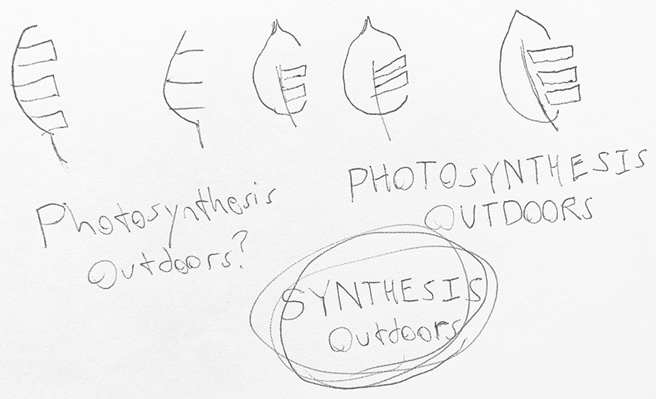
Logo & wordmark brainstorming
Project Objective
The objective of this project was to develop 3 unique interactive experiences for 3 physical stations that all use a different kind of sensor. The Interactive Catalogue station uses light sensors to detect 3 brand items on a table. Upon picking up an item, a full collection showcase will appear on the screen before them. Upon pressing a button above each sensor, an additional video will play giving an in-depth overview of the picked up product.

The Rotating Product Station allows a user to swipe their hand above a podium to rotate a backpack displayed on a screen in front of them. This interactivity is possible thanks to the use of a Leap Motion controller & a collection of backpack images taken in 360 degrees with a lazy susan. When the rotation reaches one of 3 different stop points on the front, side, & back of the bag a video overlay will play highlighting special features of the backpack.

The Touchscreen Ordering Station uses a touchscreeen as the name implies to allow the user to slide their finger across an image of a model to swap out different pieces of clothing for the head, torso, legs & feet. Each clothing item has a description that displays once it is showing on the model. Once the user assembles an ensemble they like, they can proceed to a confirmation screen that allows the selection of size & colour for each item & uses JavaScript to calculate the price for the outfit as a whole. Upon confirming, the user will receive a printed receipt for their purchase.
The Process
First came the branding. I named my brand "Synthesis Outdoors", using the process of photosynthesis & the changing of seasons as my main inspiration for the brand's theming & imagery. My brand promotes hiking while at the same time prioritizing the preservation of nature in order to appreciate the beauty that can be witnessed within it. My icon features coloured bars that are used as an accent throughout the project, & the specific colours represent the hues of natural beauty we can see in the trees during the changing of seasons from Spring to Summer to Fall. The products offered by Synthesis Outdoors are made with ethical processes in order to make as little environmental waste as possible, resulting in a slightly higher cost. The full brandbook can be accessed below.

VIEW BRANDBOOK

After the branding, I was given the framework for the three station apps. These frameworks included the main structure for each station including the html, CSS & JavaScript. I was required to alter this code in order to fit the design principles of my brand. The Interactive Catalogue Station featured primarily GSAP animations, while the Rotating Product Station required heavy usage of After Effects animations & the Touchscreen Ordering Station mainly used CSS animations that were altered in JavaScript.
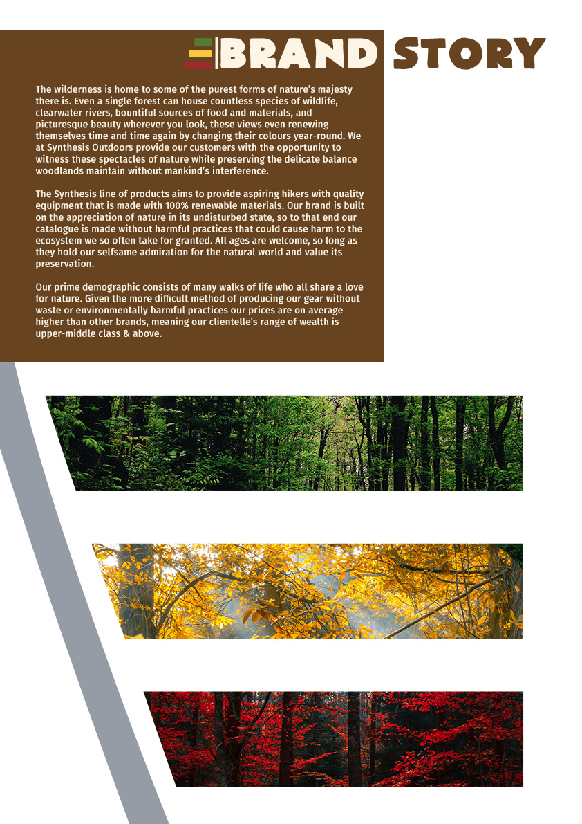
An excerpt from my brandbook
Motion Graphics Videos
This collection of videos serves as the primary eye-catcher to draw people to the retail installation. A looping instructional video explains to users how to scan the provided QR codes so they can see all 3 of ad videos that use kinetic type to express the ideologies of the brand.
Interactive Catalogue Station
This station, known as an "alternate input device" forces users to interact with physical objects to access each screen. When at rest, the station will play a looping screensaver video that explains to the user how to interact with each object & what the result will be. Once the user picks up one of the three objects, the screen will transition to an animated collection page showcasing the items that are sold alongside the one currently held by the user. After they have viewed the entire collection, the user can then press a button on the station to reveal an additional screen providing in-depth highlights on the object in their hand. This process can be repeated for all three of the products at the station, & after enough time passes without interaction the station will reset to the screensaver, ready for the next user to approach.
Rotating Product Station
This station utilizes "augmented reality" to provide the user with a unique & memorable experience that can help the product stick in their minds more effectively than if they were to simply inspect the product normally & move on. The main feature of this station is a backpack that can be viewed from 360 degrees by waving your hand above a sensor making use of a Leap Motion controller to allow for your hand gestures to actively influence the backpack on screen. At rest, the station will play a looping screensaver video that explains how to operate the station properly & serves as the front viewpoint of the bag. Once the user performs a successful gesture, the bag will rotate to one of three stop points on both sides & the back of the backpack. Each of these stop points will display extra details on aspects of the bag to better sell it as a product to the user. With an upwards gesture, the user can access an additional highlight screen to provide further information on the best uses for the backpack, one for each stop point. Once enough time passes without input, the station will reset to the screensaver in order to be ready for the next user to approach.
Touchscreen Ordering Station
This station is the least challenging of the bunch, operating off of a touchscreen which should be pretty familiar to most users. Even with this in mind, the station still challenges users by making them use broad swiping gestures to achieve the result they want. This station allows users to assemble an outfit of their choice by viewing the combinations of hats, shirts, pants & shoes on a digital model. Details are provided for each piece of clothing, & the total cost will be calculated & displayed to the user upon confirming their selection. Once the user accepts the payment, the station will print a physical receipt for them to bring to the cashier & receive their assembled outfit. Using this station saves plenty of time by allowing someone to see a complete ensemble worn on a person without having to change into & out of each piece of clothing themselves.
Marketing Materials
I was also required to create a social media video along with mockups of clothing & icons that would theoretically be used in a fashion line consistent with my brand's established rules & design principles. These showcased the versatility of my brand while still retaining consistency with my brandbook & rules.
Project Tools